July 18, 2021
Six Better Ways to Visualize Transit Reliability
Exploring better ways to visualize transit reliabilty
Reality, Perceived Reality, and Reported Reality
The feeling of confusion, concern, and irritation that comes with waiting for an uncertain bus is ubiquitous for transit riders. Sure, some systems are more punctual and reliable than others, but human nature's constant desire for certainty and information makes even the smallest deviations painful.
This desire is perhaps most apparent in airports, where the travel process comes with a relatively high sense of certainty (a reserved seat on a scheduled plane in a controlled and secured environment), but also a relatively high consequence of failure (flights are hours apart, missed connections can delay passengers for significant periods of time). Passengers form queues at the first hint of a boarding announcement or crowd nervously into a security check or border crossing. These moments reveal where confidence in the system is lowest and unreliability is highest.
For this reason, reliability typically sits at or near the top (along with service frequency) for the most important attributes of a transit service. Unfortunately, what riders experience and what is reported can often feel out of sync, or in some cases completely at odds with the passenger's reality. This is compounded by the fact that one minute of waiting time can be perceived as more than double by a passenger in some cases.
For reasons I don't quite understand, agencies seem to report on reliability as an afterthought. When reliability is discussed, it's often in broad terms and single metrics, rather than a reflection of the complex and important issue that it is. To illustrate my point, here are two examples of current practice:
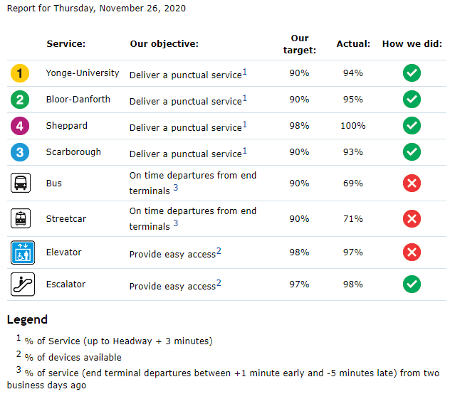
The TTC's Daily Performance Report Card (TTC Website)
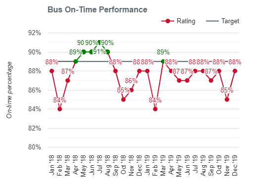
Calgary Transit's Reporting of bus on-time performance
The first image is a screenshot from the Toronto Transit Commission's (TTC) daily performance report; the second image is from Calgary Transit's website (a recent update seems to have removed it) reporting bus on-time performance over time. Here are the underlying issues that make these scorecards problematic:
- Aggregation: Averaging accross an entire day (TTC) or month (Calgary) and accross an entire system washes out any information about which routes are higher performing or how much various routes have changed over time. Even simple distinctions between express/BRT buses and regular buses or core network routes versus suburban feeders would provide a visitor insight into how the service they use is performing.
- What is measured: For the TTC, The metric by which "a punctual service" is measured is particularly problematic for buses, which use only the terminal departure time (why not at least report on-time arrivals at terminal stations also?), and can be easily met by adding slack into schedules. Calgary Transit measures on-time performance at "major stops" which is a definite improvement.
- Arbitrary benchmarks: The values that divide these reports into green (good!) and red (bad!) service are arbitrary and tell the reader that, at best, the nuance of the situation is unimportant. Hong Kong's rail system boasts a 99.9% on-time rate, should the TTC and Calgary Transit match those numbers? If all the values are in the green, should we still expect these transit systems to be trying to improve?
- Insensitive to demand: Neither report is sensitive to the number of people experiencing each delay. For example: A bus running 10 minutes late that interacts with 50 people (500 passenger-delay-minutes) is arguably better than a full subway with 500 people running 2 minutes late (1,000 passenger-delay-minutes). Neither the TTC or Calgary's reporting captures this.
I have singled out the TTC and Calgary Transit here not because they are unique, but because they are common. Agencies all over the world use versions of these scorecards, with varying forms of aggregation and reporting. Instead of transferring useful and potentially actionable information to the viewer, the simplified scorecard takes a passive approach to what is an important aspect of transit performance.
Transit is messy: Show it!
The truth is that reliability issues are often caused by external factors, in addition to internal problems of maintenance, management, and scheduling. Surface transit (buses, streetcars, light rail) are at the mercy of traffic patterns, road construction, and other potential disruptions. While some cities have made a point of prioritizing dedicated transit infrastructure such as signals and lanes, these important interventions only serve to reduce the external impact, not eliminate it.
It seems only fair, then, that the discussion and reporting on reliability find ways to take into account and communicate the interplay between a complex and chaotic city and the transit system's design. Passengers should be able to see themselves in the conversation, absorb the nuance and factors at play, and have confidence that - to the extent possible - transit agencies are doing what they can to address problems of reliability.
In the remainder of this post, I will introduce six different visuals that can help communicate how reliable a transit service is, where problems may exist, and how these problems impact individual riders. All of these visuals can be assembled by the average transit agency with standard on-board data collection systems. I would aruge that all of these visuals say more (and more useful stuff) about transit service reliability than a simple scorecard with a checkmark.
Data, Complexity, and Nuance
Before a visual conversation about reliability can take place, we need to know something about the system. This knowledge comes from data; information collected about the movement of buses and people throughout the system. Richer and more abundant data along more dimensions helps create a clearer picture. Here, we will assume that a transit agency can measure or at least estimate vehicle locations over time and passenger volumes on board the bus. Automated vehicle location (AVL) and automated passenger counter (APC) systems are becoming increasingly common in transit systems. Fare card data can also help to understand passenger loads, and in some cases provide a relatively good guess when (and if) a stop was visited. Data typically includes columns liek this:
- Timestamp
- Stop ID
- Number of boardings
- Number of alightings
- Number remaining on board
This tabulation is the output of cleaning and processing, often by matching actual times to scheduled times and calculating differences manually. This process differs depending on the data sources, but is generally quite feasible due to the highly structured data outputs of automated counting and location systems. The deviations from the schedule have been rounded to the nearest minute, since that is the level of accuracy at which bus schedules are published.
Despite being a relatively sanitized version of the data, the table closely captures individual passenger experience; an individual can look up yesterday's trip and see it reflected directly in the data. As we move our visualization away from this tabulation, we are asking the reader to separate their experience from what they are viewing. In exchange, we must provide them with insight and nuance that they may not have had before. The compromise between collective abstraction and individual experience can be balanced by providing the reader with the tools and information needed to find themselves in the data, and by providing multiple lenses through which to view the same information.
Individual Bus Trajectories
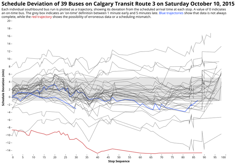
Transit is Messy: Trajectories of individual buses on Calgary Transit's Route 3
Individual bus trajectories along a route provide a first level of abstraction. Here, all the data for a day is shown to the user, nothing is hidden behind an average or a set goal. The only concession to readability is the addition of "jitter" to each trajectory to help distinguish overlapping lines. The grey box shows where reporting policy and reality intersect; the viewer can make their own mind up as to whether this constitutes a fair definition of "on time" or not.
The trajectory chart works precisely because of the messiness of the data. The complexity of the system is starting to emerge, and viewers can immediately see the concentration of trajectories around a certain average path. Without needing to understand the mathematics, we can estimate means, medians, and even variance by looking at the concentrations, ordering, and spread of the lines. The question of performance now becomes one of area: what proportion of all the lines are inside the box?
This chart also introduces nuance (read: questions) into the discussion of on-time performance. The TTC example we started with cares only about the start of the lines when reporting reliability. Shouldn't we be counting the whole line? What about trajectories that leave the box and come back? What happens if the on-time box is widened? Narrowed? What is a reasonable number for each of these scenarios? These conversations can now be had with the public because of the nuance this chart includes.
The Marey Diagram
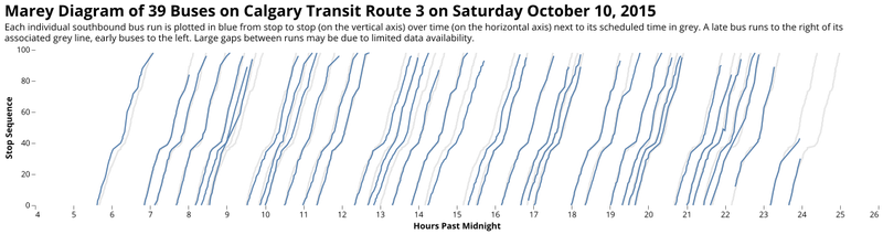
Marey diagrams are especially useful for visualizing bus bunching.
Marey diagrams are another way of transparently displaying non-aggregated data to a viewer in an intuitive way. Here, the progress of a bus along the route is compared with the schedule. A real-time line to the right of a grey one indicates a delayed bus. Marey diagrams are especially useful for showing the phenomenon of bus bunching: two lines meet and remain stuck together as two buses bunch together. Tracing the bunched lines back to the start of the route can provide hints as to why a bus was bunched (i.e. it departed late, or met some kind of delay on-route). Producing daily charts like this for each route would allow riders to see what exactly happened, and give them the confidence that the transit agency is aware of these situations.
Moving up the Ladder of Abstraction
Ladders of abstraction were introduced by American linguist S. I. Hayakawa in his 1939 book Language in Action. The ladders represent movement in thought and discussion between concrete examples and the broader concepts they represent, with each rung having their own merit and drawbacks. A great data-oriented and interactive perspective on abstraction can be found in Bret Victor's 2011 online article Up and Down the Ladder of Abstraction.
Seeing the data directly lends a certain sense of transparency and personal connection to the results, but it can only go so far. While it is possible to dump an entire month's worth of data (over 24,000 trajectories) for a route into a single chart, at a certain point the addition of more data provides diminishing returns. With an understanding on the complexity, noise, and nuance in how individual buses behave, we can begin to create more abstract measures that reflect these individual stories.
On-Time Performance and Punctuality
On-time performance is a common go-to abstraction. We count the number of events that fall within a certain schedule deviation (e.g. one minute early to five minutes late), and divide by the total number of events in that time range. Transit agencies use this calculation religiously, but it is extremely blunt: A bus that is 6 minutes late is just as bad as one that is 20 minutes late, something that is obviously untrue. It is also very passenger-insensitive: on top of not incorporating any information about passenger demand, it does not respect that a given route or stop may be just one part of a passenger's journey, and that experiencing multiple small reliability problems in different parts of the system can compound to make the reliability experience quite poor for an individual.
One small improvement is to measure the average punctuality of a given route over a given time period. This measure adds up all the schedule deviations observed and divide by the total number of observations. A perfectly on-time system (all 's are zero) will have -measure of zero. A measure of two means that the average bus is two minutes late. Note that with this measure it's possible to have a wildly unpredictable service and still arrive at a measure of zero (a bus 5 minutes early cancels out a bus that's 5 minutes late). Aggregate measures like this will always wash out just how spread out the reliability of the system is.
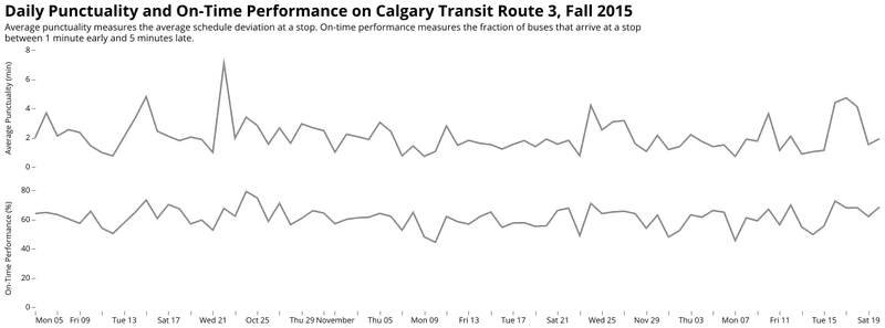
Punctuality and on-time performance on Calgary Transit's Route 3.
Neither of these metrics incorporate the distribution of delays at stops, beyond their central or average values. This means that unpredictability, the key aspect of reliability, is not reflected in an on-time performance or average punctuality metric. We need then to find some way of representing just how random things are at a given stop along the route.
Dot-And-Whiskers
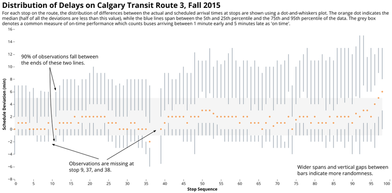
A dot-and-whiskers plot showing how schedule deviations are distributed on a bus route.
Both the distributions and the central tendencies of the data can be combined into a single, simplified version of what is commonly called a "box-and-whiskers" plot. Here, the 95th percentile and the 5th percentile are indicated as the extreme ends of the distribution, with 90% of arrivals at stops falling in between these two extremes. This means for a passenger there is still a one in ten chance of a bus arriving outside of this distribution (that's once a week for a commuter, assuming the return trip is similar). Overlaid with the typical on-time performance measures demonstrates areas where arrivals are much less predictable than others. These are good areas for schedule improvements or right-of-way enhancements. The plot communicates a lot of measures at once: The most on-time 50% of buses fall within the gap between the two vertical bars that surround the median dot, and the median (marking the point at which an equal number of buses arrive before and after) allows the viewer to trace the randomness of the bus along the route.
The Buffer Time Index
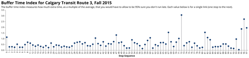
The buffer time index for each stop-to-stop movement on Calgary Transit's Route 3 in the Fall of 2015.
Now that we have an idea of what the distribution of the schedule deviations on the route look like, we can step up the abstraction ladder once more and use a measure that incorporates the distribution into a single value: the buffer time index. The buffer time index measures the difference in the 95th percentile of travel time between two points (so a 1 in 20 chance of being longer than that) and compares it to the average travel time. A value of 1.0 means that you have to roughly double the expected travel time between the two points in question to be sure you won't be late. A perfect service has a value of zero.
In the visual above you can immediately see where unreliable stands out: Stop 72 to 73 along the route and the last three stops are especially unpredictable. As a rider, this chart can help you understand where the reliability pain points are. As a planner, this can show you where issues with the schedule exist or where reliability-focused infrastructure might be needed. Best of all, it does a better job than the previous measures of capturing what passengers really care about: How unreliable their trip time might be. The higher the buffer index, the more time people have to budget to make sure they arrive on time, and the longer the transit trip takes, in practice.
Incorporating the Passenger
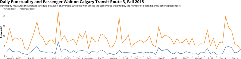
So far, we have not taken into account the number of passengers that experience the variation in bus travel. This requires some judgment on what counts as a "wait" to passengers. An early bus, for example, might miss passengers who intended to catch it. A late bus is commonly considered a delay to boarding passengers, but it may be worse for alighting passengers who are intending arrive at their destination at a specific time. Even in the simplified example above where any deviation (early or late) is considered the same, the effects of passenger volumes at specific stops can amplify where the issues are. In fact, all of the above diagrams can be recreated using "passenger wait" values instead of the schedule deviation value
So far, we have not taken into account the number of passengers that experience the variation in bus travel. This requires some judgment on what counts as a "wait" to passengers. An early bus, for example, might miss passengers who intended to catch it. A late bus is commonly considered a delay to boarding passengers, but it may be worse for alighting passengers who are intending arrive at their destination at a specific time. Even in the simplified example above where any deviation (early or late) is considered the same, the effects of passenger volumes at specific stops can amplify where the issues are. In fact, all of the above diagrams can be recreated using "passenger wait" values instead of the schedule deviation value
Towards A Better Scorecard
We have seen a number of ways that a transit agency can visualize and report on the reliability of their service. All of the measures above provide some nuance while also conveying useful statistics about the service. With today's web development technologies, it is not difficult to build a website that reports reliability data on a route-by-route basis and views it through a number of different lenses. Using the visuals above can help passengers understand just how messy the system can be, where the problem points are, and allow them to make their own judgment call about the quality of the transit service. A public transit system's data should be publicly available, and publicly digestible. This is a way to start.
The examples in this article are by no means exhaustive. With smart card data, it is possible to construct individual path-based reliability measures that capture an individual's journey through a system. There are other measures out there that can capture other aspects of transit service reliability (and other performance measures), and other ways to visualize the same data.
To transit agencies: I hope to see many new reliability reporting tools that incorporate these visual elements (and improve on them!) in the future. While reliable service is not always under the control of a transit agency, reporting is. Showing passengers that you understand the problems and are open to talk about them is a way of building trust and understanding. In a world with little nuance left, let's try our best to create a little more.
Inspiration
The following list of works provided inspiration for this article, and are fantastic resources for measuring transit performance and constructing visuals:
- Tufte, E. R. (2006). Beautiful Evidence. Graphics Press.
- Victor, Brett (2011). Up and Down the Ladder of Abstraction
- Barry, M. and Card, B. (2014). Visualizing MBTA Data
- Hu, W. X., & Shalaby, A. (2017). Use of Automated Vehicle Location Data for Route- and Segment-Level Analyses of Bus Route Reliability and Speed. Transportation Research Record: Journal of the Transportation Research Board, 2649, 9–19.